By Suzanne Macpherson
ISBN13: 9780060775001; ISBN: 0060775009; Imprint: Avon; On Sale: 08/29/2006; Format: Mass Market PB; Trimsize: 4 3/16 x 6 3/4; Pages: 384; $5.99
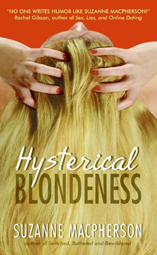
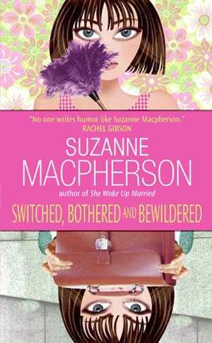
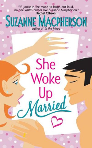
Here is a sneak peak at Suzanne Macpherson's cover for her upcoming contemporary romance, HYSTERICAL BLONDENESS. It's a departure from her prior two books, SWITCHED, BOTHERED AND BEWILDERED and SHE WOKE UP MARRIED. We think it's eye-catching, fun, and sexy--everything a contemporary romance cover should be. (Click covers for book information)
I get more questions about covers than about any other part of my job. No, we don't just slap any old piece of art on the books. We have meetings and even pre-meetings about the covers. Yes, we use real, live models for the historical romance covers. And, yes, we pay attention to hair color!
But in the past few years, one of the most difficult parts of my job is to figure out what to do with the contemporary romance covers. It seems as if the contemporary market has been taken over by paranormals and/or romantic suspense.
I believe that there are readers out there who still want to read wonderful contemporary romance--ones without either murderers or vampires (or both!).
Conversation starters:
If you ruled the book world, what would you like to see on contemporary romance covers? What do you like? And what can you not stand to see ever again? Is photography the way? Do you prefer bold images, or quieter images? And what makes you pick up a book when you're browsing the bookstores?
I truly want to know!


5 Comments:
i like the nice vector graphic ones instead of the traditional painted ones or the real pictures. I find the vector ones more upbeat, fresh and young!
1:28 PM
I've missed out on some great contemporary romance because the covers said chick-lit to me.
Anyone But You (the reissue) has a great cover, but it doesn't suit the story. The clinch says historical. Torso shots whisper erotic.
Contemporary, gorgesously written books need eye catching individualized covers.
I like the hair shot for Hysterical Blonde - assuming it fits the story.
6:34 PM
I prefer photo covers, definitely. Cartoonish covers are fun, but they've been way overdone, IMHO. Not all contemporary readers are in their 20's, after all, and that seems to be the demographic they're aimed toward. An interesting cover gets my attention the same way a great photograph or an interesting piece of artwork does... and a great title doesn't hurt! This cover says 'funny' and 'contemporary' but doesn't necessarily say '20's' or '30's' - the woman could be anywhere from 20 to 50. I like that. :)
12:38 PM
One thing that totally turns me off is seeing the hero's face on the cover, oddly enough. I don't want to be shown what the hero looks like, and where everyone has different tastes, the rendering put on the cover may not be attractive to everyone reading the book. When I see a pix, that images sticks in my head and then I don't want to read a book with a hero I find unattractive. Usually side or distant views of the hero are fine, but face on? Turns me off. I've actually left books on shelves because of this.
What I do like is a cover that evokes the feeling of the book. If its fun and contemporary, give me a cover that reflects that. Dark and moody, ditto.
9:46 AM
Wow I go on vacation and come back to find-- I'm in technicolor!!! I am extremely happy with the cover of Hysterical Blondeness, and Lucia did a great job working that out. I do prefer the photographic covers myself at this time in Rom Com's development. This cover, and In The Mood are my favorites. The Blonde hair pictured really does reflect the story perfectly! It captured the "roots" of my charater LOL> Thanks Avon and Lucia! Suzanne Macpherson
9:08 PM
Post a Comment
<< Home